


How to Identify Warm vs Cool Wallpaper Undertones
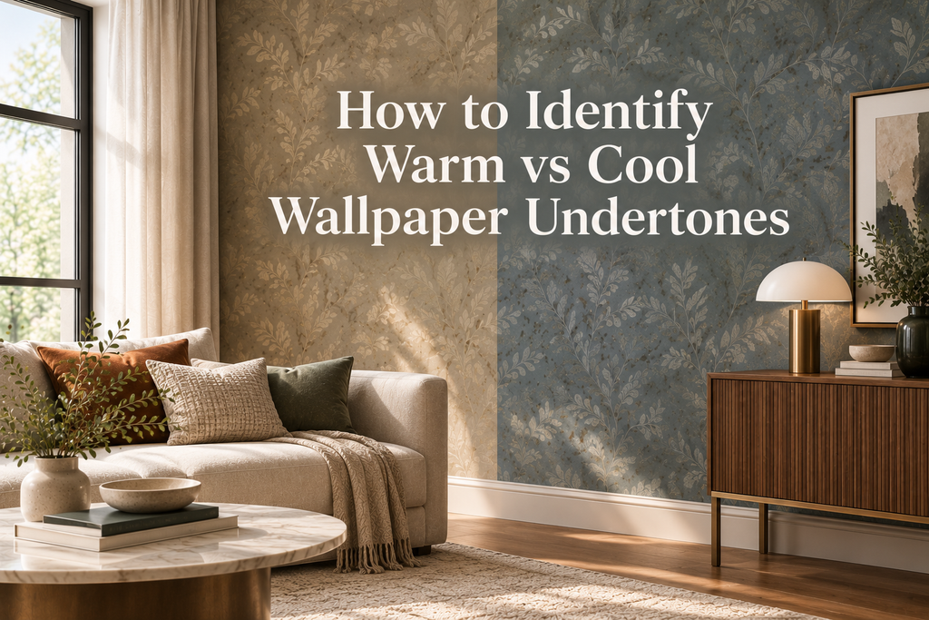
Choosing wallpaper by its main color is only the beginning. A wallpaper described as beige, gray, white, green, or blue can look completely different depending on its underlying undertone. These subtle shifts may seem insignificant on a small sample, but once wallpaper covers an entire wall, they can strongly influence how the room feels.
Understanding warm versus cool wallpaper undertones helps you make more confident design decisions. It can explain why one beige wallpaper works beautifully with your flooring while another suddenly looks yellow, or why a gray wallcovering feels unexpectedly blue beside your sofa.
For a sophisticated interior, the goal isn't necessarily to match every color perfectly. It's to understand how colors relate to one another and create a palette that feels intentional.
What Are Wallpaper Undertones?
An undertone is the subtle color that exists beneath a wallpaper's dominant color.
The dominant color is usually obvious. The undertone is what gives that color its particular character.
For example, two wallpapers may both be called gray, but one could have a blue undertone while another has a beige undertone. Similarly, two beige wallpapers may look noticeably different because one leans toward yellow and another toward pink or gray.
Common warm undertones include:
-
Yellow
-
Cream
-
Beige
-
Brown
-
Red
-
Orange
-
Warm gold
Common cool undertones include:
-
Blue
-
Green
-
Violet
-
Blue-gray
-
Cool silver
Some wallpapers are relatively neutral, but even neutral-looking colors usually lean slightly warmer or cooler when compared with other shades.
Warm vs. Cool: What Is the Difference?
Warm wallpaper colors generally create a feeling of comfort, richness, and intimacy. They often work naturally with materials such as natural wood, leather, linen, brass, and warm stone.
Cool wallpaper colors can create a fresher, calmer, and more contemporary atmosphere. They often pair naturally with gray stone, glass, black metal, chrome, and cooler textiles.
Neither temperature is inherently better.
The right choice depends on the room, the existing materials, the lighting, and the mood you want to create.
Why Undertones Matter So Much With Wallpaper
Paint can sometimes be changed relatively easily, but wallpaper is a significant visual commitment.
A wallpaper can cover one statement wall or surround an entire room. Because of this scale, subtle undertones become much more noticeable.
Consider a soft gray wallpaper.
On your computer screen, it may appear neutral. Once installed, you may discover that it has a strong blue undertone. If the room contains warm beige upholstery, honey-colored wood, and cream curtains, the contrast may be much stronger than you expected.
The wallpaper isn't necessarily a poor choice. It simply has a different color temperature than you initially perceived.
Understanding undertones allows you to anticipate these relationships before installation.
The Most Reliable Test: Compare, Don't Isolate
The easiest way to identify an undertone is to compare the wallpaper with other colors.
Looking at one sample by itself makes subtle undertones difficult to recognize. Comparison creates context.
If you're evaluating a beige wallpaper, place it next to:
-
Warm ivory
-
Cool white
-
Neutral beige
-
Gray
-
Natural wood
You may suddenly notice that the beige looks more yellow, pink, gray, or brown than it did on its own.
The same technique works with almost every color.
A gray wallpaper might reveal blue or green undertones. A white wallpaper might reveal cream or blue. A green wallpaper might lean toward yellow, blue, or gray.
If you're unsure about an undertone, put the color next to something else.
Don't Trust a Digital Image Alone
Online wallpaper browsing is incredibly useful for discovering patterns and narrowing down your options, but screens aren't reliable for judging subtle color temperature.
The appearance of a digital image can be affected by:
-
Screen calibration
-
Display brightness
-
Device settings
-
Photography lighting
-
Image editing
-
Surrounding colors
This is particularly noticeable with pale and neutral wallpapers.
A physical sample is much more useful because it allows you to see the actual material, surface, color variation, and texture.
Whenever possible, test the sample in the room where it will be installed.
How to Identify Warm White Wallpaper
White may seem like the simplest color, but it is one of the easiest to misjudge.
White wallpaper can lean toward:
-
Cream
-
Yellow
-
Beige
-
Pink
-
Blue
-
Gray
-
Green
Warm white wallpapers tend to feel softer and more inviting. Cool whites can feel crisp and contemporary.
If your room contains warm oak, walnut, cream fabrics, or brass, a warm white may integrate naturally.
If your space includes cool gray, black, blue, chrome, or silver, a cooler white may feel more harmonious.
However, contrast can also be effective. You don't have to make every element the same temperature.
How to Identify Warm vs. Cool Beige
Beige is often described as a neutral, but there is no single version of beige.
Some beige wallpapers contain strong yellow undertones.
Others lean toward:
-
Pink
-
Gray
-
Brown
-
Cream
-
Taupe
To understand which direction your wallpaper takes, compare it against pure white and cool gray.
If it suddenly appears yellow or creamy beside cool gray, it is likely warmer than you initially thought.
If it appears noticeably gray or slightly pink against warmer colors, its underlying temperature may be cooler or more complex.
This is why relying only on a product name such as "beige" or "taupe" isn't enough.
How to Identify Warm vs. Cool Gray
Gray is another color where undertones can completely change the character of a room.
A gray wallpaper may contain:
-
Blue
-
Green
-
Violet
-
Beige
-
Brown
Blue-gray tends to feel crisp and contemporary.
Green-gray can create a sophisticated, organic atmosphere.
Greige combines gray with warmer beige qualities and is often more versatile in interiors containing natural materials.
Purple-gray can create a more refined or dramatic effect.
If you're choosing gray wallpaper, compare several samples simultaneously rather than evaluating one in isolation.
The differences become much easier to see.
Green Wallpaper Can Be Warm or Cool
Green is particularly interesting because it can move across the color spectrum.
A yellow-based olive or moss green can feel warm and earthy.
A blue-based emerald, teal, or forest green can feel cooler and more dramatic.
Gray-green often sits somewhere between the two.
This makes green wallpaper extremely versatile, but it also means that its undertone should be considered carefully when coordinating furniture and accessories.
Natural wood can work beautifully with both warm and cool greens, although the specific wood tone can change the overall balance.
Blue Wallpaper Is Not Always Cold
Blue is generally associated with cool colors, but its undertones can make a significant difference.
A blue wallpaper with subtle green qualities may feel fresh and natural.
A blue with violet or gray undertones can feel more sophisticated and atmospheric.
A blue with warmer muted qualities may feel softer than a bright, crisp blue.
This is especially important when choosing dark blue wallpaper. Navy, midnight blue, and blue-gray can behave very differently depending on their underlying tones and the lighting in the room.
Look at the Wallpaper's Secondary Colors
Patterned wallpaper requires another level of observation.
A design may have a dominant background color but contain several secondary tones that influence how it interacts with the rest of the room.
For example, a predominantly neutral botanical wallpaper might include subtle:
-
Sage green
-
Dusty blue
-
Warm brown
-
Cream
-
Terracotta
These secondary colors can become the bridge between wallpaper and the rest of your interior.
Instead of asking only, "What color is this wallpaper?" ask:
"What colors are actually contained within this design?"
That question can reveal far more useful information.
Test Wallpaper With Your Flooring
Flooring should be one of the first materials you compare with your wallpaper.
Wood floors are particularly influential because their undertones can range from pale yellow and honey to reddish brown, neutral oak, or deep chocolate.
Stone and tile can introduce cooler gray, blue, beige, or green qualities.
Place the wallpaper sample directly beside the floor rather than holding it against a blank wall.
Look for relationships rather than exact matches.
A warm wood floor and cool wallpaper can create beautiful contrast. A warm wallpaper and cool stone can also work.
The key is making sure the combination feels deliberate.
Test It With Your Furniture
Your largest furniture pieces should also be part of the test.
Place the wallpaper sample beside:
-
Sofa upholstery
-
Bed fabric
-
Dining chairs
-
Cabinets
-
Wood furniture
-
Large rugs
Don't worry about creating an exact color match.
Instead, consider whether the wallpaper enhances the furniture or makes its undertones appear unintentionally strange.
For example, a cool gray wallpaper might make a cream sofa appear more yellow. That doesn't automatically mean the combination is wrong, but you should know that the contrast exists before committing.
Lighting Can Completely Change Undertones
One of the biggest mistakes in wallpaper selection is evaluating a sample under only one lighting condition.
Natural light changes throughout the day, while artificial lighting introduces another layer of color.
Morning
Depending on the direction of the windows, morning light may emphasize cooler qualities or soften certain colors.
Afternoon
Stronger daylight can reveal more detail in the wallpaper's pattern and surface.
Evening
Warm artificial lighting often enhances yellow, beige, brown, and red undertones.
Night
The artificial lighting scheme may become the dominant influence on the wallpaper.
For this reason, place the sample in the room and observe it throughout the day.
A wallpaper that looks perfect at noon should also feel appropriate when the room is being used at night.
Texture Changes How Color Is Perceived
Wallpaper isn't just a flat color.
Texture, embossing, and surface variation affect how light interacts with the wall.
A textured neutral wallpaper may appear richer because shadows move across its surface.
An embossed dark wallpaper may reveal different tonal qualities depending on where light hits the raised pattern.
This means undertone testing should consider more than the color itself.
Evaluate:
Color + texture + pattern + lighting
together.
That's much closer to how the finished wall will actually look.
Warm and Cool Colors Can Work Together
There is no rule that says a warm room must contain only warm colors.
In fact, combining warm and cool elements can create depth.
Consider:
Cool blue wallpaper + warm oak furniture + soft beige textiles
The warm wood and beige can soften the cool wall.
Or:
Warm taupe wallpaper + cool gray upholstery + cream accessories
The cream can help connect the different temperatures.
Mixed-temperature interiors often feel more layered than rooms where everything has exactly the same undertone.
The important thing is to create visual connections between the different elements.
Use a Bridge Color
If your wallpaper and furniture have different temperatures, introduce a bridge color.
A bridge color appears naturally between two sides of the palette.
For example:
-
Blue wallpaper
-
Natural oak
-
Warm beige textiles
Here, beige can help connect the cool blue with the warm wood.
Another combination might be:
-
Warm taupe wallpaper
-
Cool gray sofa
-
Soft ivory accessories
The ivory helps transition between the two.
This technique can make contrasting undertones feel intentional rather than accidental.
Consider Your Metal Finishes
Metal finishes can also influence the temperature of a room.
Warm metals such as brass, bronze, copper, and aged gold can reinforce warm colors.
Cooler metals such as chrome and stainless steel can emphasize cool qualities.
You don't need to coordinate every metal with the wallpaper.
Instead, consider the overall composition.
A cool wallpaper with brass can create a particularly sophisticated contrast, while warm wallpaper with chrome can provide a sharper contemporary feeling.
Create a Real Material Board
One of the most effective ways to test a wallpaper palette is to create a physical material board.
Include your wallpaper sample alongside the materials that will remain in the room:
-
Flooring
-
Sofa fabric
-
Wood
-
Curtains
-
Rug
-
Cabinet finish
-
Countertop or stone
-
Metal finish
Then step back.
Look at everything together rather than analyzing each item individually.
Does the palette feel balanced?
Does anything suddenly look too yellow, blue, pink, or gray?
Does the wallpaper feel connected to the rest of the room?
This simple exercise can reveal problems before installation.
Test the Wallpaper at Full Visual Scale
A small sample can sometimes be misleading.
Pattern repetition becomes much more noticeable when wallpaper covers a full wall.
If you're considering a large-scale floral, geometric, abstract, or architectural pattern, pay attention to how much visual weight it carries.
A strong pattern may make its colors feel more intense.
A subtle textured wallpaper may appear much quieter when repeated across a larger area.
When possible, use the largest practical sample available and imagine how the pattern will repeat.
Consider the Adjacent Rooms
Color doesn't stop at the doorway.
If your room connects to a hallway, living area, dining space, or open-plan kitchen, consider how the wallpaper looks from neighboring spaces.
The rooms don't need to match.
Instead, think about visual continuity.
You might use:
-
Warm neutral in one room
-
Deeper taupe in another
-
Muted green in a third
The colors can be different while sharing similar undertones, materials, or accent colors.
This creates a home that feels connected without becoming repetitive.
A Simple Undertone Testing Process
If you want a straightforward method, follow these five steps.
1. Get a Physical Sample
Don't make the final decision from a screen.
2. Compare It With Neutral References
Use warm white, cool white, beige, and gray to reveal subtle undertones.
3. Place It Beside Existing Materials
Test the wallpaper with your actual flooring, furniture, textiles, and finishes.
4. Check It Under Different Lighting
Observe it in morning, afternoon, evening, and artificial light.
5. Live With It
Leave the sample in the room for several days before making the final decision.
This process turns color selection from guesswork into a much more reliable design exercise.
Common Undertone Mistakes
Assuming the Color Name Tells You Everything
"Beige," "gray," or "white" describes the dominant color, not necessarily the undertone.
Choosing Based on Online Images
Screens can distort subtle color relationships.
Ignoring Existing Materials
A wallpaper may look beautiful alone but behave differently beside your flooring and furniture.
Testing Under One Light Source
A color can change significantly between daylight and artificial lighting.
Trying to Match Everything
Exact matching isn't necessary. Good interiors often depend on controlled contrast.
Ignoring Pattern and Texture
The surface of wallpaper changes how light interacts with its color.
Frequently Asked Questions
How do I quickly tell whether wallpaper is warm or cool?
Compare the sample with warm and cool whites, beige, and gray. The wallpaper's hidden yellow, pink, blue, green, or violet qualities will become easier to recognize.
Is greige warm or cool?
Greige can be either. Some versions lean strongly toward warm beige, while others have a cooler gray character. Always evaluate the specific wallpaper rather than relying on the name.
Can warm wallpaper work with cool furniture?
Yes. Warm and cool elements can create beautiful contrast when they are connected through neutral colors, materials, or repeated accents.
Should wallpaper match the undertone of my floor?
It doesn't have to match exactly. Similar undertones can create harmony, while contrasting undertones can create visual interest. The important thing is that the relationship feels intentional.
Does natural light affect wallpaper undertones?
Yes. The direction and intensity of natural light can change how warm or cool a wallpaper appears throughout the day.
Are neutral wallpapers always safe?
Not necessarily. Neutral colors can still have strong undertones. Testing a physical sample in the actual room is the safest way to understand how the color will behave.
Final Thoughts
Identifying warm versus cool wallpaper undertones is one of the simplest ways to make more confident design decisions.
Instead of looking only at the obvious color, look deeper.
Compare the sample. Check the undertone. Test it with your materials. Observe it under different lighting. Consider the entire room.
The goal isn't to make every element identical. It's to create relationships between colors that feel considered and natural.
When you understand undertones, choosing wallpaper becomes less about guessing whether a color will work—and more about knowing why it will.