


How to Test Your Color Palette Before Committing
Choosing a wallpaper color is rarely as simple as liking a swatch on a screen. A shade that looks soft and elegant online can appear cooler, warmer, darker, or more saturated once it covers an entire wall. Add natural daylight, artificial lighting, flooring, furniture, and surrounding materials, and the same wallpaper can create a completely different impression.
That is why testing your color palette before committing is one of the smartest steps in the wallpaper selection process.
For a design-focused brand like Walloro, the goal is not simply to find colors that look attractive individually. The real objective is to create a palette that works as a complete visual system—one where wallpaper, furniture, lighting, architectural details, and accessories feel intentionally connected.
Whether you are choosing a subtle neutral, a rich dark wallpaper, an expressive pattern, or a textured wallcovering, the right testing process can prevent expensive mistakes and help you create a more sophisticated interior.
Why You Should Test a Color Palette Before Choosing Wallpaper
Color behaves differently depending on its surroundings.
A warm beige may look creamy beside a cool gray but appear almost yellow next to natural oak. A deep navy may feel dramatic in a brightly lit room but almost black in a darker hallway. Even a soft green can shift significantly depending on whether it is surrounded by warm wood, white trim, or cool metals.
Wallpaper makes this even more important because it often covers a large visual area.
Instead of evaluating color as a small square, you need to understand how it behaves:
-
Across a large wall
-
In different lighting conditions
-
Beside your existing furniture
-
Against your flooring
-
With your window treatments
-
Alongside artwork and accessories
-
In relation to adjacent rooms
A successful palette should still feel balanced when all of these elements are considered together.
Start With the Wallpaper, Not the Accessories
One common mistake is building a room around several separate color ideas and choosing wallpaper at the end.
A better approach is to select the wallpaper as your starting point.
This is especially useful when working with patterned, embossed, or textured wallcoverings because they often contain several subtle tones that may not be immediately obvious.
Look closely at the wallpaper and identify:
-
The dominant color
-
Secondary colors
-
Background tone
-
Accent colors
-
Warm or cool undertones
-
Texture and finish
-
Overall pattern intensity
A wallpaper that initially appears gray, for example, might contain subtle beige or blue undertones. Those undertones can become extremely important when you begin choosing furniture and accessories.
Think of the wallpaper as the foundation of your color story.
Always Test a Physical Wallpaper Sample
Digital screens are useful for narrowing down your options, but they should never be the final test.
Monitor settings, brightness, screen technology, and surrounding colors can all affect how a wallpaper appears online.
A physical sample gives you something much more valuable: a real-world reference.
Place the sample directly against the wall where the wallpaper will eventually be installed. Don't evaluate it only while holding it in your hand or looking at it on a desk.
A wall changes the way you perceive color because of its scale and surrounding surfaces.
If possible, keep the sample large enough to reveal the wallpaper's:
-
Pattern scale
-
Texture
-
Color variation
-
Surface finish
-
Contrast
-
Relationship between background and motif
The larger the sample, the easier it becomes to imagine the finished wall.
Test the Palette in Different Lighting
One of the most important rules of color selection is simple:
Never judge a wallpaper under only one type of light.
Natural daylight changes throughout the day. Artificial lighting can change it again in the evening.
Test your sample during several periods:
Morning
Morning light may make colors feel cooler, softer, or more muted depending on the room's orientation.
Afternoon
Stronger daylight can reveal undertones and make certain colors appear more vibrant.
Evening
As natural light disappears, the room's artificial lighting becomes more influential. Warm bulbs can make beige, brown, cream, terracotta, and certain greens appear richer.
Night
This is particularly important if the room is used heavily in the evening. A color that looks perfect during daylight may feel dramatically different under artificial illumination.
Instead of asking, "Does this color look good?" ask:
"Does this color still look good throughout the day?"
That question will lead to a much better decision.
Pay Attention to Undertones
Two colors can appear almost identical at first glance while having completely different undertones.
This is one of the biggest reasons seemingly coordinated interiors sometimes feel slightly "off."
Common undertones include:
-
Warm beige
-
Cool gray
-
Yellow
-
Pink
-
Blue
-
Green
-
Brown
-
Red
For example, a warm beige wallpaper may work beautifully with walnut furniture and brass accents. Pairing it with a strongly blue-based gray sofa, however, could create an unintended visual conflict.
You don't necessarily need every color in a room to have the same undertone. Contrast can be beautiful.
The important thing is that the contrast feels intentional.
Build a Material Palette, Not Just a Color Palette
Color doesn't exist independently from materials.
A room containing the same beige wallpaper can look completely different depending on whether it includes:
-
Light oak
-
Dark walnut
-
Marble
-
Stone
-
Black metal
-
Brass
-
Linen
-
Velvet
-
Leather
-
Glass
This is why testing wallpaper beside your actual materials is more reliable than comparing color swatches alone.
Create a small physical material board containing your wallpaper sample and representative samples of your major finishes.
Include:
-
Wallpaper
-
Flooring
-
Main furniture finish
-
Upholstery
-
Curtains
-
Metal finishes
-
Cabinetry
-
Accent materials
You don't need to include every decorative object. Focus on the materials that occupy the most visual space.
Use the 60–30–10 Principle as a Starting Point
A useful way to organize a palette is the 60–30–10 rule.
Approximately:
-
60% becomes the dominant visual color
-
30% becomes the secondary color
-
10% becomes the accent
This isn't a strict mathematical rule. It is simply a useful way to prevent every color from competing for attention.
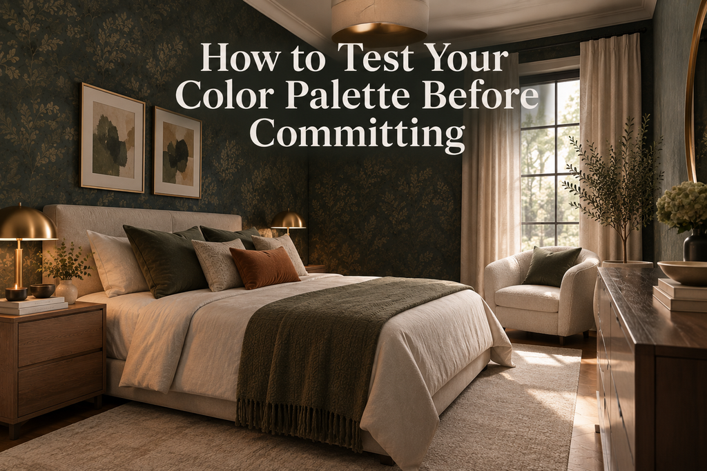
For example, imagine a sophisticated bedroom with deep green wallpaper.
The palette might include:
60%: deep green wallpaper and related large surfaces
30%: warm ivory bedding and upholstery
10%: aged brass and muted terracotta accents
The result feels layered without requiring dozens of colors.
The same principle works with neutral wallpaper. A soft greige wallcovering could become the foundation, while natural wood and a darker accent color provide depth.
Test Colors Against Your Furniture
Don't choose wallpaper in isolation from the furniture.
Place the wallpaper sample behind or beside the major pieces in the room.
Look at it with:
-
Sofas
-
Beds
-
Dining tables
-
Cabinets
-
Chairs
-
Rugs
-
Curtains
Pay particular attention to large pieces because they have enough visual weight to change the overall perception of the wallpaper.
If the furniture is already purchased, the wallpaper needs to work with it.
If you are designing from scratch, you have much more freedom. In that case, choose the wallpaper first and allow it to guide the furniture palette.
Don't Forget the Flooring
Flooring is often overlooked during wallpaper selection, even though it occupies a substantial portion of the room.
A warm wood floor can make a cool wallpaper feel more balanced. A gray stone floor can reinforce cool undertones. Dark flooring can increase the dramatic quality of deeper wall colors.
Place the wallpaper sample near the floor rather than only at eye level.
Ask yourself:
-
Do the undertones work together?
-
Does one surface make the other look too yellow?
-
Is the overall contrast intentional?
-
Does the room still feel balanced?
These small observations can make a significant difference.
Create Three Versions of Your Palette
If you're uncertain about how dramatic you want the room to feel, don't test only one palette.
Create three versions:
1. Light Palette
Use softer neutrals and lighter materials around the wallpaper.
This creates an airy, understated atmosphere.
2. Balanced Palette
Combine the wallpaper with medium-depth colors, natural materials, and moderate contrast.
This is often the easiest approach for everyday interiors.
3. Dramatic Palette
Introduce darker furniture, stronger accents, richer metals, or deeper textiles.
This can transform the same wallpaper into a much more luxurious and theatrical composition.
Testing all three approaches can reveal which direction best reflects the character you want for the room.
Test Pattern Scale Alongside Color
Color is only part of the decision.
A wallpaper's pattern scale can dramatically change how its color is perceived.
A large-scale botanical design may make a color feel more expressive. A fine geometric pattern may make the same color appear more restrained. Embossed textures can introduce shadows that subtly deepen the surface.
When testing your sample, consider:
Color + scale + texture + lighting
rather than color alone.
A palette that looks perfect with a small sample may feel much stronger when the pattern repeats across an entire wall.
Consider Adjacent Rooms
Your room doesn't exist in isolation.
If the space connects directly to a hallway, living room, dining area, or open-plan kitchen, look at the wallpaper sample from outside the room as well.
This is particularly important when using bold colors.
You don't need every room to use the same palette. In fact, excessive matching can make a home feel predictable.
Instead, create relationships between rooms.
A blue-green wallpaper in one room might connect to a softer sage in another. A warm neutral hallway might transition into a richer brown or burgundy elsewhere.
The colors can change while the overall design language remains consistent.
Test Dark Wallpaper More Carefully
Dark wallpaper deserves additional attention because lighting can dramatically influence its appearance.
Charcoal, navy, forest green, chocolate brown, burgundy, and other deep shades can look luxurious and sophisticated, but they may also appear significantly darker than expected once installed.
Test dark wallpaper in:
-
Natural daylight
-
Artificial light
-
Corners of the room
-
Areas near windows
-
Areas away from windows
Texture is also important. Embossed or dimensional surfaces can prevent a dark wall from looking completely flat because light interacts with the surface differently throughout the day.
Give the Sample Time
Don't make the final decision immediately.
If possible, leave the sample in the room for several days.
Live with it.
See it when you wake up. Look at it in the afternoon. Turn on the lights in the evening. View it while sitting on the sofa rather than standing directly in front of the wall.
This gives you a much more realistic understanding of how the color will feel as part of your everyday environment.
Sometimes a wallpaper that initially feels unfamiliar becomes more appealing after several days. The opposite can also happen.
Common Color Palette Testing Mistakes
Even careful homeowners can make a few predictable mistakes.
Choosing From a Screen
Digital images are useful for inspiration but cannot fully reproduce the color and texture of physical wallpaper.
Testing Only Under Daylight
A room may look completely different at night.
Ignoring Undertones
Two similar colors can clash because their underlying tones are different.
Testing Against a White Wall Only
White can make colors appear cleaner or more saturated than they will look against your actual materials.
Forgetting the Floor
Flooring can strongly influence the warmth or coolness of a palette.
Choosing Too Many Accent Colors
More colors don't necessarily create more personality. Often, they create competition.
Testing Too Small a Sample
A tiny swatch may not reveal the visual impact of a repeating pattern.
Making a Decision Too Quickly
Color needs to be experienced in context, not simply judged at first glance.
A Simple Wallpaper Color Testing Checklist
Before committing to a wallpaper, ask:
-
Have I seen a physical sample?
-
Have I placed it on the actual wall?
-
Have I checked it in morning and afternoon light?
-
Have I viewed it under evening lighting?
-
Have I identified its undertones?
-
Have I compared it with my flooring?
-
Have I tested it against major furniture pieces?
-
Have I considered curtains and rugs?
-
Does the pattern scale work for the room?
-
Does the texture change its appearance under different light?
-
Does it work with adjacent rooms?
-
Have I considered both a lighter and more dramatic palette?
-
Have I lived with the sample for more than a few minutes?
If the answer is yes to most of these questions, you're no longer choosing wallpaper based purely on first impressions. You're making a considered design decision.
The Best Color Palette Is the One That Works as a Whole
Testing a color palette before committing isn't about finding one "perfect" color.
It's about understanding relationships.
The wallpaper should work with the architecture. The architecture should work with the lighting. The lighting should reveal the texture. The furniture should support the wallpaper rather than compete with it. Accessories should reinforce the palette instead of introducing unnecessary visual noise.
When all these elements work together, even a relatively simple color scheme can feel sophisticated.
And that's the real advantage of testing before committing: you stop choosing colors individually and start designing the room as a complete experience.
Frequently Asked Questions
How long should I test wallpaper before buying?
If possible, live with a physical sample for several days. This gives you the opportunity to see it under changing daylight and artificial lighting.
Should wallpaper match my furniture?
It doesn't have to match exactly. Coordinating undertones, materials, and visual intensity is usually more effective than choosing identical colors.
How do I know if wallpaper has warm or cool undertones?
Compare the wallpaper sample with known warm and cool neutrals. Natural materials such as wood can also help reveal whether the wallpaper leans warm, cool, or neutral.
Should I test wallpaper in every room?
You should test it in the room where it will be installed. If that room connects visually to other spaces, also check how the color looks from those adjacent areas.
Can dark wallpaper work in a small room?
Absolutely. Dark wallpaper can create depth, intimacy, and a sophisticated atmosphere. The key is to consider lighting, pattern scale, surrounding colors, and the overall visual balance.
Final Thoughts
A beautiful wallpaper can completely transform an interior, but choosing the right color is about more than finding an attractive shade.
Test the sample. Test the lighting. Test the undertones. Test it with your materials. Then give yourself time to experience the palette.
The best interiors rarely happen by accident. They come from understanding how individual design decisions interact—and choosing wallpaper that makes the entire room feel intentional.
With the right testing process, you can move beyond simply asking "Do I like this color?" and begin asking the more important question:
"Does this color belong in the room I want to create?"