

How Wallpaper Creates Optical Illusions of Space
A room does not always feel the way its measurements suggest it should.
A compact room can feel surprisingly open. A narrow hallway can appear longer. A low ceiling can seem taller. A large room can even feel more intimate than expected.
The difference often comes down to perception.
Wallpaper cannot physically move walls, raise ceilings, or add square footage. But it can influence how the eye reads proportion, depth, direction, scale, and distance. Through pattern, color, texture, repetition, and visual rhythm, a wallcovering can create subtle optical illusions that change the way a room is experienced.
This is one of the most interesting qualities of wallpaper.
It does not simply decorate the existing architecture. It can visually reinterpret it.
What Is an Optical Illusion in Interior Design?
An optical illusion occurs when the eye interprets a space differently from its physical reality.
Interior designers use this principle constantly.
Mirrors can make a room appear larger. Lighting can make ceilings feel higher. Furniture proportions can make a space feel more spacious or more compact.
Wallpaper can achieve similar effects because walls occupy such a large portion of our visual field.
When a wall is covered with a carefully selected pattern, the eye no longer reads it simply as a flat boundary. Instead, it responds to the movement, repetition, contrast, scale, and direction created by the design.
The result can be a subtle change in perceived space.
The room has not changed.
The way we see it has.
Can Wallpaper Make a Small Room Feel Larger?
Yes—but not every wallpaper will create this effect.
To make a compact room feel more open, the goal is usually to reduce visual interruption and create a sense of continuity.
Soft colors, restrained contrast, and patterns with consistent movement can help the eye travel across the walls rather than stopping at individual boundaries.
Instead of making the wall feel like a solid barrier, the wallpaper becomes a continuous visual surface.
This can be particularly effective when the same wallcovering continues across multiple walls.
Rather than visually dividing the room into separate sections, the pattern creates cohesion.
The result can make the space feel more expansive.
Light Colors Can Push Walls Into the Background
Color plays one of the most important roles in spatial perception.
Lighter colors generally reflect more light and can make boundaries feel less visually heavy.
Soft ivory, pale gray, muted beige, light blue, and understated green can create a sense of openness when paired with appropriate lighting and low visual contrast.
But the key is not simply choosing the lightest possible wallpaper.
A bright white wall with strong architectural shadows can still feel visually restrictive.
Meanwhile, a slightly deeper neutral with subtle texture may create a more sophisticated sense of depth.
The relationship between color, lighting, and pattern is what matters.
Dark Wallpaper Can Also Create Depth
Dark wallpaper is often associated with making rooms feel smaller.
That is not always true.
In the right space, a deep wallcovering can create an entirely different optical effect.
Instead of making a room feel compressed, it can make the wall visually recede into a darker background—particularly when the design has subtle tonal variation.
A deep charcoal, navy, forest green, or rich brown can create a sense of depth and enclosure.
This can be especially effective in:
-
Dining rooms
-
Bedrooms
-
Libraries
-
Home offices
-
Lounge areas
The result is less about making the room look physically larger and more about creating a stronger sense of atmosphere and dimensionality.
Vertical Patterns Can Make Ceilings Feel Higher
One of the most familiar wallpaper illusions involves vertical movement.
Patterns with vertical lines, elongated motifs, or upward-flowing forms encourage the eye to move from floor to ceiling.
This can strengthen the perception of height.
The effect works particularly well when the pattern is relatively continuous and not interrupted by strong horizontal elements.
Vertical wallpaper can complement:
-
Tall windows
-
Floor-to-ceiling curtains
-
Vertical wall molding
-
Tall cabinetry
-
Narrow architectural proportions
The goal is not to make the pattern scream “tall.”
It should simply establish an upward visual rhythm.
When the eye naturally follows that rhythm, the ceiling can feel higher.
Horizontal Patterns Can Emphasize Width
The same principle works horizontally.
Patterns that move laterally can encourage the eye to travel from one side of the room to the other.
This can be useful in narrow rooms where width feels more limited than height.
A subtle horizontal rhythm can visually connect opposite sides of the room and reduce the sense of confinement.
However, horizontal stripes are not the only option.
Broad botanical forms, flowing geometric patterns, elongated textures, and panoramic compositions can all create horizontal movement without looking overly literal.
The most sophisticated solutions create the illusion without making the optical trick obvious.
Large-Scale Patterns Can Change the Perception of Proportion
Large patterns can be surprisingly effective in smaller rooms.
It may seem logical that a small room needs a small pattern, but this is not always the case.
A large-scale design can reduce the number of visual repetitions the eye encounters.
Instead of seeing dozens of small motifs, the eye reads the composition as a few larger shapes.
This can actually make the wall feel more organized.
A carefully selected large-scale pattern can also create a strong visual identity, preventing a compact space from feeling visually insignificant.
The important factor is balance.
A large pattern needs enough visual breathing room to remain legible.
Small Patterns Create a Different Kind of Illusion
Small-scale patterns produce repetition and rhythm.
When the contrast is controlled, this repetition can create a continuous visual texture that makes the wall feel expansive.
The individual motifs become less important than the overall field.
This can work particularly well in:
-
Hallways
-
Small bedrooms
-
Compact entryways
-
Narrow transitional spaces
The wall begins to read as one surface rather than a collection of individual details.
Perspective Patterns Can Suggest Depth
Some wallpaper designs create an especially strong sense of dimensionality by using perspective.
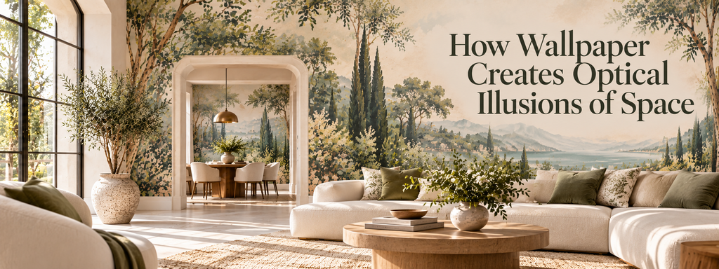
Architectural motifs, layered botanical compositions, atmospheric landscapes, arches, or patterns with overlapping forms can create the suggestion of space beyond the wall.
The eye interprets differences in scale, layering, and contrast as depth cues.
A darker foreground combined with lighter or less-defined elements in the background can make a flat surface feel more dimensional.
This technique is particularly powerful when the wallpaper is designed to create a sense of visual distance rather than simply repeat a motif.
Pattern Repetition Can Extend a Room
Repetition gives the eye a visual path to follow.
When a pattern continues across a wall, the eye naturally moves from one motif to the next.
This can make the surface feel larger than its individual sections.
If the pattern continues around corners, the effect can become even stronger.
Instead of reading each wall independently, the eye begins to experience the room as a connected environment.
This is one reason full-room wallpaper can sometimes feel more spacious than using a single feature wall.
The visual boundary between surfaces becomes less pronounced.
Continuous Wallpaper Can Hide Boundaries
Feature walls are useful, but they can also emphasize the physical limits of a room.
A single wallpapered wall surrounded by contrasting painted walls creates a strong boundary.
That can be beautiful—but it also tells the eye exactly where the wall begins and ends.
Using a continuous wallpaper across multiple walls can soften those boundaries.
The eye follows the design rather than stopping at each corner.
This can be particularly useful when trying to make a small or awkwardly shaped room feel more unified.
The room does not necessarily become larger.
It simply becomes harder for the eye to divide into separate pieces.
Texture Can Create Visual Depth Without Taking Up Space
Texture is another powerful illusion tool.
Embossed, raised, woven, or layered wallcoverings can create highlights and shadows across the surface.
These variations make the wall appear more dimensional.
The effect can be subtle.
A sophisticated textured wallpaper does not need to imitate stone or another physical material literally. Even a refined embossed pattern can create enough tonal variation to prevent the wall from appearing completely flat.
This added depth can make a room feel richer without adding physical objects that would occupy valuable floor or surface space.
Contrast Controls How Strongly the Wall Is Perceived
Contrast is one of the most important factors in optical illusions.
High contrast makes patterns more noticeable.
Low contrast allows them to blend into the overall environment.
If the goal is to make walls visually recede, a low-contrast design can be highly effective.
If the goal is to make a particular wall feel closer and more architectural, stronger contrast may be preferable.
This creates an important distinction:
Wallpaper does not always need to make a room feel larger.
Sometimes the better design decision is to make a specific wall feel closer.
A distant wall in a large living room may benefit from stronger visual weight, making the overall room feel more balanced.
Color Temperature Can Influence Visual Depth
Warm and cool colors can also contribute to perceived distance.
Cooler colors, particularly soft blues and blue-greens, can create a sense of visual recession.
Warmer tones can feel more immediate and enveloping.
But this effect depends heavily on saturation and contrast.
A dark, saturated blue may feel much more intimate than a pale blue-gray.
Likewise, a soft warm beige may feel airy and understated rather than visually close.
The surrounding palette also matters.
Wallpaper should always be evaluated within the complete room rather than judged by color alone.
Wallpaper Can Make a Long Hallway Feel More Balanced
Hallways are ideal spaces for using optical principles.
A long, narrow corridor can sometimes feel like a tunnel because the eye is naturally drawn toward the far end.
Wallpaper can alter that experience.
A pattern with strong lateral movement can make the side walls feel more connected.
A dramatic design at the far end can create a destination.
A continuous pattern can soften the corridor's linear boundaries.
Even the scale of the motif can influence how quickly the eye travels through the space.
Instead of trying to hide the hallway's length, wallpaper can help turn that length into an intentional architectural feature.
Wallpaper Can Change the Perceived Distance Between Furniture and Walls
The illusion does not stop at the architecture.
Wallpaper also affects how furniture is perceived against the wall.
A high-contrast wallcovering can make a sofa, bed, console, or cabinet stand out clearly from the background.
A low-contrast wallpaper can allow furniture to visually merge into the wall.
Texture can create a layered relationship between the object and surface.
Pattern scale can influence whether the furniture feels large or small by comparison.
This means wallpaper can indirectly affect the perceived scale and placement of the objects in front of it.
Optical Illusions Work Best When They Are Subtle
The most successful wallpaper illusions are rarely obvious.
A room should not look as though it is trying to trick you.
Instead, the design should feel natural.
The eye simply experiences the room as:
-
Taller
-
Wider
-
Deeper
-
Softer
-
More connected
-
More balanced
-
More intimate
This is why sophisticated wallpaper design often relies on controlled visual cues rather than exaggerated effects.
The illusion should support the architecture rather than compete with it.
Common Mistakes When Using Wallpaper to Alter Space
Choosing a pattern only because it makes the room “look bigger”
Spatial perception depends on much more than pattern direction.
Using too much contrast
High contrast can create visual fragmentation instead of openness.
Ignoring furniture scale
Wallpaper should be considered alongside the objects occupying the room.
Treating every small room the same way
A narrow hallway, compact bedroom, and small dining room require different approaches.
Forgetting lighting
A wallpaper that appears soft in daylight may become much stronger under artificial lighting.
Overusing optical effects
When every wall is competing to change the perception of space, the room can become visually confusing.
The best result usually comes from one clear spatial intention.
How to Choose Wallpaper for the Illusion You Want
Before choosing a wallpaper, identify the actual problem.
Does the room feel:
Too narrow?
Consider patterns and compositions that encourage horizontal movement.
Too low?
Look for vertical rhythm and elongated forms.
Too deep or disconnected?
Consider giving the far wall stronger visual presence.
Too fragmented?
Use continuous wallpaper to create visual cohesion.
Too flat?
Explore texture, embossing, layering, or dimensional pattern.
Too visually crowded?
Choose lower contrast and more restrained repetition.
Too empty?
A larger-scale pattern can establish stronger visual structure.
This approach turns wallpaper selection into a design decision rather than a purely decorative one.
Final Thoughts
Wallpaper can create optical illusions of space because our perception of a room depends on more than its physical measurements.
Vertical movement can strengthen height. Horizontal rhythm can emphasize width. Low-contrast patterns can help walls recede. Darker designs can create depth and intimacy. Large-scale motifs can simplify a surface, while repetition can create continuity. Texture can add dimensionality without taking up physical space.
None of these techniques changes the architecture.
They change the way the architecture is experienced.
That is what makes wallpaper such a powerful design material. When pattern, color, scale, texture, lighting, and proportion work together, a wall becomes more than a surface.
It becomes a visual tool for shaping how the entire room is perceived.