


The Science Behind Wallpaper Patterns That Feel Natural
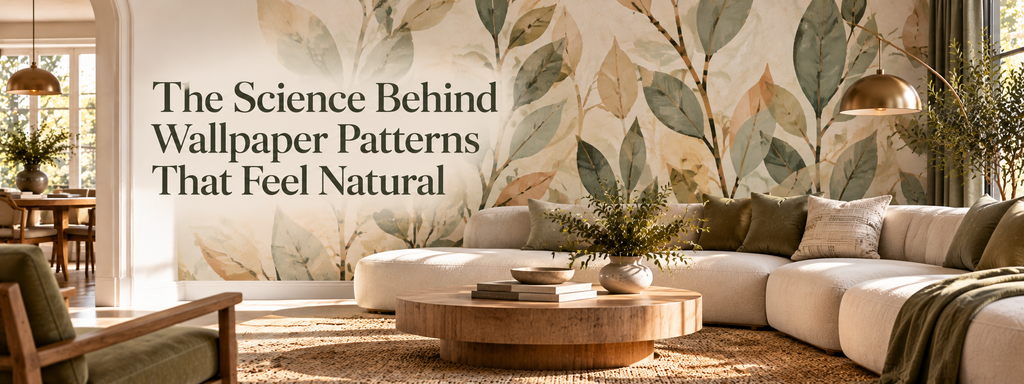
Why do some wallpaper patterns feel effortlessly natural, while others appear artificial, overwhelming, or difficult to live with? The answer lies partly in how the human brain processes visual information. Our perception of a pattern is shaped by repetition, symmetry, contrast, movement, and the relationships between shapes. These elements influence whether a design feels harmonious, stimulating, or visually restless.
Nature offers countless examples of patterns that balance order with variation. Tree branches repeat familiar structures without becoming identical. Waves create rhythmic movement, while stone surfaces combine irregular details into a coherent whole. These patterns are rarely perfectly uniform, yet they often feel visually connected.
Wallpaper designs can use similar principles to create interiors that feel balanced and intentional. The goal is not necessarily to imitate leaves, flowers, or natural materials. Even geometric and abstract patterns can feel organic when their proportions, rhythms, and colors work together.
For homeowners exploring modern wallcoverings, understanding these principles offers a more thoughtful way to choose wallpaper. Rather than focusing only on whether a pattern looks attractive in a sample, it becomes possible to consider how the design will influence the entire room.
1. The Brain Naturally Searches for Visual Order
Human vision is constantly organizing information. When we enter a room, we quickly recognize edges, shapes, contrasts, and repeated elements without consciously examining every detail. The brain groups related visual information to make complex environments easier to understand.
Wallpaper plays an interesting role in this process because its pattern usually repeats across a relatively large surface.
When a design has a clear rhythm, the eye can follow its structure. Repeated shapes, consistent spacing, and related colors create recognizable relationships. Even an intricate pattern can feel orderly when its elements follow a coherent visual system.
By contrast, a design with competing focal points, inconsistent spacing, and excessive contrast may demand more attention. This can make the wall feel busy, especially when the surrounding furniture and accessories are equally expressive.
However, complexity itself is not the problem. Detailed wallpaper can add richness, sophistication, and character. What matters is whether the complexity feels organized.
Consider a geometric wallcovering with multiple intersecting lines. If the lines follow a consistent structure, the design may feel architectural and controlled. A similarly detailed pattern with unrelated shapes and abrupt changes may feel more energetic or unpredictable.
When evaluating wallpaper, look for a recognizable visual relationship between its elements. A coherent pattern gives the eye something to understand, allowing detail to become an asset rather than a distraction.
2. Why Natural Patterns Combine Order and Imperfection
Natural environments rarely rely on perfect repetition. Instead, they contain recurring structures with small differences in shape, spacing, direction, and scale.
A tree has branches that follow a recognizable growth pattern, but no two branches are identical. Water creates repeating ripples, yet every wave changes slightly. Stone may contain layers and veins that share a common direction while varying in thickness and intensity.
These examples illustrate a useful design principle: visual order can coexist with irregularity.
Wallpaper that reflects this balance often feels organic because it avoids the mechanical appearance of perfectly identical elements. A botanical design may repeat leaves while varying their direction. An abstract pattern may use branching lines that divide and reconnect. A mineral-inspired wallcovering may combine broad tonal areas with fine, irregular markings.
These designs suggest movement without losing their overall structure.
The concept is also related to fractal geometry, which examines patterns that contain recurring structures at different scales. Certain natural forms, such as fern leaves and branching systems, exhibit fractal-like characteristics. Wallpaper does not need to reproduce a mathematical fractal to benefit from the broader principle of layered repetition.
For example, a wallcovering might combine large flowing forms with smaller details that echo their direction. This creates a connection between the pattern's overall composition and its finer elements.
The result can feel richer than a design built around a single repeated shape.
Importantly, naturalness does not require visible imperfections in every pattern. A highly symmetrical design can still feel harmonious. The lesson is simply that controlled variation is one effective way to create visual interest without sacrificing coherence.
3. Repetition Creates Rhythm, While Variation Creates Interest
Repetition is fundamental to wallpaper design. It allows a motif to continue across a wall, establishing continuity and giving the surface a recognizable identity.
From a perceptual perspective, repetition makes a design more predictable. Once the eye recognizes a recurring element, it can anticipate how the pattern will continue.
This predictability can contribute to visual comfort, particularly when the repetition is neither too dense nor too dominant for the room.
However, repeating exactly the same element at the same interval can also create a rigid appearance. Some designs benefit from variations in line, spacing, shape, or color that interrupt the repetition without destroying its rhythm.
Think of the difference between a perfectly uniform grid and an organic arrangement of related forms. The grid emphasizes precision, while the organic arrangement introduces movement.
Both approaches have their place in interior design.
A structured geometric pattern may complement a minimalist living room with clean furniture lines. A more fluid design may work better in a bedroom intended to feel relaxed and layered.
The decision should depend on the atmosphere you want to establish.
When choosing wallpaper, consider three questions:
-
Can you recognize the pattern's rhythm from a distance?
-
Does the repetition feel consistent without becoming monotonous?
-
Do variations in the design add depth or create unnecessary distraction?
The most effective pattern is not necessarily the one with the most variation. It is the one in which repetition and variation work together to support the room's overall character.
4. Visual Complexity Is About More Than the Number of Details
A common assumption is that simple wallpaper always feels calm while intricate wallpaper always feels busy. In reality, the relationship is more complicated.
Visual complexity depends on several interacting factors, including the number of elements, their contrast, their spacing, their scale, and the clarity of their arrangement.
A detailed damask pattern in closely related shades may appear refined and relatively quiet. A simple design made from large black shapes on a bright white background may create a much stronger visual impact.
The difference lies in how prominently the pattern separates itself from its surroundings.
This distinction matters when wallpaper becomes part of a larger interior composition. The wall interacts with furniture, flooring, windows, artwork, lighting, and decorative objects. Each element contributes to the amount of visual information in the room.
If the wallpaper is intricate and high-contrast, quieter furniture and restrained accessories can help establish balance. If the wallpaper is subtle, a sculptural light fixture or distinctive furniture piece may provide the necessary focal point.
Neither approach is inherently better.
A useful strategy is to decide which element should lead the composition. If the wallpaper is intended to be the primary visual feature, allow the other elements to support it. If the room already has a strong architectural feature or expressive furniture, a more restrained pattern may work better.
The aim is not to eliminate complexity, but to distribute it thoughtfully.
5. Symmetry and Asymmetry Create Different Visual Experiences
Symmetry provides a recognizable sense of order. It appears in classical architecture, traditional ornament, and many established wallpaper styles.
A symmetrical pattern often feels deliberate because corresponding elements repeat in balanced positions. This can create a formal, composed appearance, especially when combined with architectural molding, centered furniture arrangements, or traditional finishes.
Asymmetry creates balance differently. Instead of mirroring elements, it distributes visual weight through variations in shape, position, direction, or color.
Many natural forms are asymmetrical, which is one reason irregular botanical and abstract designs can feel organic.
Imagine two wallpapers. One features identical geometric motifs arranged in precise rows. The other features flowing shapes that overlap and vary slightly in size. The first may reinforce a sense of structure, while the second may introduce movement and informality.
Neither necessarily feels more natural in every setting.
A symmetrical pattern might be exactly what a room with strong architectural lines needs. An asymmetrical design might provide a welcome counterpoint to a rigid modern interior.
The most successful choice depends on the relationship between the wallpaper and the architecture.
Rather than asking whether symmetry is better than asymmetry, consider whether the room would benefit from greater order, more movement, or a balance between the two.
6. Why Curved Lines and Organic Shapes Feel Different From Geometry
The geometry of a wallpaper pattern influences its visual character.
Curved lines, branching forms, and irregular contours often create a sense of flow. Straight lines, sharp angles, and tightly controlled shapes tend to emphasize structure and precision.
These are broad visual tendencies rather than universal psychological rules, but they can be useful when planning an interior.
A flowing pattern can complement rounded furniture, curved sofas, upholstered chairs, and soft textiles. Its movement may reinforce the forms already present in the room.
A geometric design can work particularly well with linear furniture, metal finishes, minimalist lighting, and contemporary architectural details.
Contrast, however, can be equally effective.
A room dominated by rectangular furniture may benefit from wallpaper with curved lines. The contrast introduces a different type of movement and prevents the composition from becoming overly rigid.
Likewise, a room filled with rounded forms may gain definition from a geometric wallcovering.
The key is to consider how the pattern's shapes relate to the shapes of the objects around it.
When these relationships feel deliberate, wallpaper becomes part of the interior's visual language rather than an isolated decorative feature.
7. Color Changes How We Experience Pattern
Color influences the way a wallpaper pattern is perceived. It affects contrast, visual prominence, and the degree to which individual shapes stand apart from the background.
A high-contrast pattern tends to make its elements more noticeable. Dark motifs against a light background may emphasize repetition, while contrasting colors can make a design feel more energetic.
Low-contrast patterns often create a more continuous appearance. When neighboring shades are similar, the eye may perceive the design as a unified surface rather than a series of separate shapes.
This is one reason tonal wallpaper can feel particularly harmonious in interiors where the goal is to create depth without introducing a dominant focal point.
Nevertheless, a natural-looking pattern does not have to use muted or earthy colors. Botanical designs can be vivid, abstract patterns can be monochromatic, and geometric wallcoverings can feel understated through carefully controlled contrast.
What matters is the relationship between the colors and the pattern's structure.
For example, a design with flowing lines may feel soft when its colors blend gradually. The same design may feel more dramatic when the lines become darker and more distinct.
Color distribution also matters. A pattern with regularly placed accent colors can create a clear rhythm, while scattered accents may introduce more movement.
When selecting wallpaper, compare its palette with the room's flooring, upholstery, wood tones, and natural light. The objective is not necessarily to match every color, but to create relationships that make sense within the space.
8. Texture Helps the Brain Interpret Materials
Texture introduces another layer of information into wallpaper design.
The human visual system uses changes in shading, fine details, and surface irregularities to interpret the appearance of materials. These cues can suggest whether a surface resembles fabric, stone, plaster, wood, or another material.
Wallpaper can use these visual signals to create the impression of depth and material richness without requiring the wall itself to be made from the material being represented.
Linen-inspired designs, for instance, may use fine intersecting lines to suggest woven fibers. Stone-inspired patterns may feature irregular veining and layered tonal changes. Plaster-like designs may use subtle variations that resemble the unevenness of a finished surface.
Embossed wallpaper adds physical relief to this visual effect. Raised details interact with light and cast shadows, making the pattern appear different depending on the viewing angle and illumination.
This can make a wallcovering feel more dimensional than a completely flat print.
Yet realistic texture alone does not guarantee a natural-looking result. The scale, contrast, and distribution of the texture must suit the room.
A highly pronounced stone pattern may look convincing on a broad feature wall but overwhelming in a narrow hallway. A subtle textile-inspired design may be more suitable when the room already contains strong wood grain, patterned upholstery, or other tactile materials.
Think about texture as part of the overall material palette. Wallpaper should complement the surfaces around it rather than compete with all of them simultaneously.
9. Pattern Scale Changes With Viewing Distance
Wallpaper patterns are not experienced at a single distance.
From across a room, the eye may register the overall rhythm, color distribution, and density of a design. Up close, the smaller details become more visible, revealing the intricacy of the print or texture.
This shift can significantly affect how a wallpaper feels once installed.
A pattern that appears delicate on a small sample may become much more prominent when repeated across a full wall. Conversely, a bold motif may feel balanced when the entire composition is visible.
Scale also influences the relationship between the wall and the room's architecture.
Large-scale motifs can create a strong visual identity and work well on broad, relatively uninterrupted surfaces. Smaller patterns may produce a more continuous texture, particularly when their contrast is restrained.
However, there is no universal rule that small rooms require small patterns. A large-scale design can be effective in a compact interior if its colors, proportions, and placement are carefully considered.
The important question is how the motif will interact with the actual wall.
Doors, windows, corners, shelving, and furniture can interrupt a pattern and change the way it is perceived. Before making a final decision, try to view a larger sample or a full-repeat image.
Look at the design from the doorway, from the main seating area, and from close range.
A wallpaper that works at all three distances is more likely to deliver the intended effect.
10. Lighting Can Transform the Character of a Pattern
Lighting affects how wallpaper colors, textures, and patterns appear throughout the day.
Natural daylight changes in intensity and direction, while artificial lighting introduces its own color characteristics and shadows. These differences can make a wallcovering look softer, sharper, warmer, or cooler depending on the conditions.
Textured and embossed wallpaper is particularly sensitive to directional lighting. Light falling across a raised surface can emphasize its contours, creating visible shadows and stronger depth. More diffuse lighting may soften those effects.
Pattern contrast can also appear different under changing illumination. Fine details that are easy to see in bright daylight may become less distinct in a dimly lit room.
This matters when selecting wallpaper for bedrooms, hallways, dining rooms, and other spaces with different lighting conditions.
A pattern that feels subtle in a bright showroom may appear more dominant in a room with focused spotlights. Similarly, a low-contrast design may lose some of its definition under insufficient lighting.
Before committing to a wallcovering, examine a sample in the room where it will be installed. Observe it in daylight and under the artificial lighting you plan to use.
If possible, view it at different times of day and from several angles.
This simple step can reveal details that are difficult to predict from a product photograph alone.
11. Why Some Wallpaper Looks Natural in One Room but Artificial in Another
A wallpaper design does not exist independently of its surroundings. Its perceived character changes according to the furniture, materials, lighting, and architecture around it.
A flowing botanical pattern may feel effortless in a room with natural wood, soft upholstery, and relaxed proportions. The same pattern might feel disconnected in an interior dominated by polished metal, rigid geometric furniture, and strong linear details.
That does not mean the two styles cannot work together. It means their relationship needs to be considered.
Sometimes harmony comes from similarity. A wallpaper may echo a curve in the furniture, repeat a color found in the flooring, or reinforce the texture of nearby materials.
In other situations, harmony comes from contrast. A structured geometric pattern can give definition to a soft interior, while an organic design can introduce movement into a highly architectural room.
The distinction is whether the contrast feels intentional.
A useful approach is to identify the wallpaper's primary contribution. Is it meant to introduce movement, establish a focal point, soften the architecture, add texture, or connect several colors within the room?
Once that purpose is clear, it becomes easier to decide whether the design should blend in or stand apart.
The most successful interiors are not necessarily those in which every element matches. They are the ones in which different elements have a clear relationship.
12. How to Choose Wallpaper That Feels Naturally Balanced
The science of visual perception becomes most useful when translated into practical design decisions.
Use the following process to evaluate a wallpaper before choosing it.
Define the intended atmosphere. Decide whether the room should feel calm, formal, energetic, relaxed, or dramatic. This gives you a starting point for choosing between structured geometry, flowing motifs, subtle textures, and expressive patterns.
Identify the room's existing visual rhythm. Look at furniture silhouettes, architectural lines, window shapes, and decorative details. Determine whether the room is predominantly linear, rounded, symmetrical, or irregular.
Evaluate repetition and variation. Consider whether the pattern's rhythm feels appropriate for the space. Highly regular designs can reinforce order, while controlled irregularity can introduce movement.
Compare pattern complexity with contrast. Do not judge a design by its detail alone. Consider how strongly the motifs stand out from the background and how much attention they demand.
Check the scale across the full wall. Use a larger sample or full-repeat preview whenever possible. Assess how the pattern interacts with doors, windows, corners, and furniture.
Test color and texture under real lighting. Observe how the design changes in daylight and artificial light. Pay particular attention to embossed finishes and subtle tonal variations.
Consider the surrounding materials. Place the sample alongside upholstery, flooring, curtains, and wood finishes. Look for relationships rather than exact matches.
Create visual breathing space. If the wallpaper has a strong pattern, allow some other elements to remain relatively quiet. This helps the design maintain its presence without overwhelming the room.
These steps do not eliminate personal taste. Instead, they provide a framework for understanding why a design works and how it might behave once installed.
13. Common Misconceptions About Natural-Looking Wallpaper
Several assumptions can limit the way people approach wallpaper selection.
Misconception 1: Only botanical wallpaper feels natural.
Nature-inspired imagery is one option, but natural-looking design can also emerge through organic geometry, layered textures, tonal variation, and coherent repetition.
Misconception 2: Simple patterns are always more relaxing.
A simple pattern with strong contrast can feel more visually prominent than an intricate design in closely related shades. Complexity and intensity are not the same thing.
Misconception 3: Natural-looking wallpaper must use earthy colors.
Muted greens, browns, and mineral neutrals can support an organic atmosphere, but color alone does not determine whether a design feels natural. Structure, rhythm, and context matter just as much.
Misconception 4: Perfect symmetry always looks artificial.
Symmetry can create clarity, balance, and elegance. It becomes especially effective when it complements the room's architectural structure.
Misconception 5: A pattern that looks good on a sample will look the same on the wall.
The full repeat, viewing distance, lighting, and surrounding materials can change the design's impact considerably. Evaluating wallpaper in context is essential.
Understanding these distinctions makes it easier to move beyond assumptions and choose wallcoverings based on how they actually function within an interior.
Final Thoughts: The Best Patterns Balance Structure and Sensation
The science behind wallpaper patterns that feel natural reveals an important principle: visual harmony depends on relationships. Repetition, variation, symmetry, color, texture, and scale work together to influence how a design is experienced.
Patterns that feel natural do not necessarily imitate the outdoors. They often share qualities found in coherent visual systems: recognizable rhythm, balanced complexity, appropriate contrast, and a sense that the individual elements belong together.
Yet there is no single formula that works for every interior. A symmetrical geometric wallcovering may bring order to one room, while a fluid abstract design may create a more convincing atmosphere in another. The architecture, lighting, materials, and proportions of the space all influence the result.
For Walloro, choosing wallpaper is an opportunity to consider more than the appearance of a single wall. It is a way to shape visual rhythm, introduce depth, connect materials, and establish the character of an interior.
When a pattern works with its surroundings, it feels less like an isolated decoration and more like a natural part of the design.