


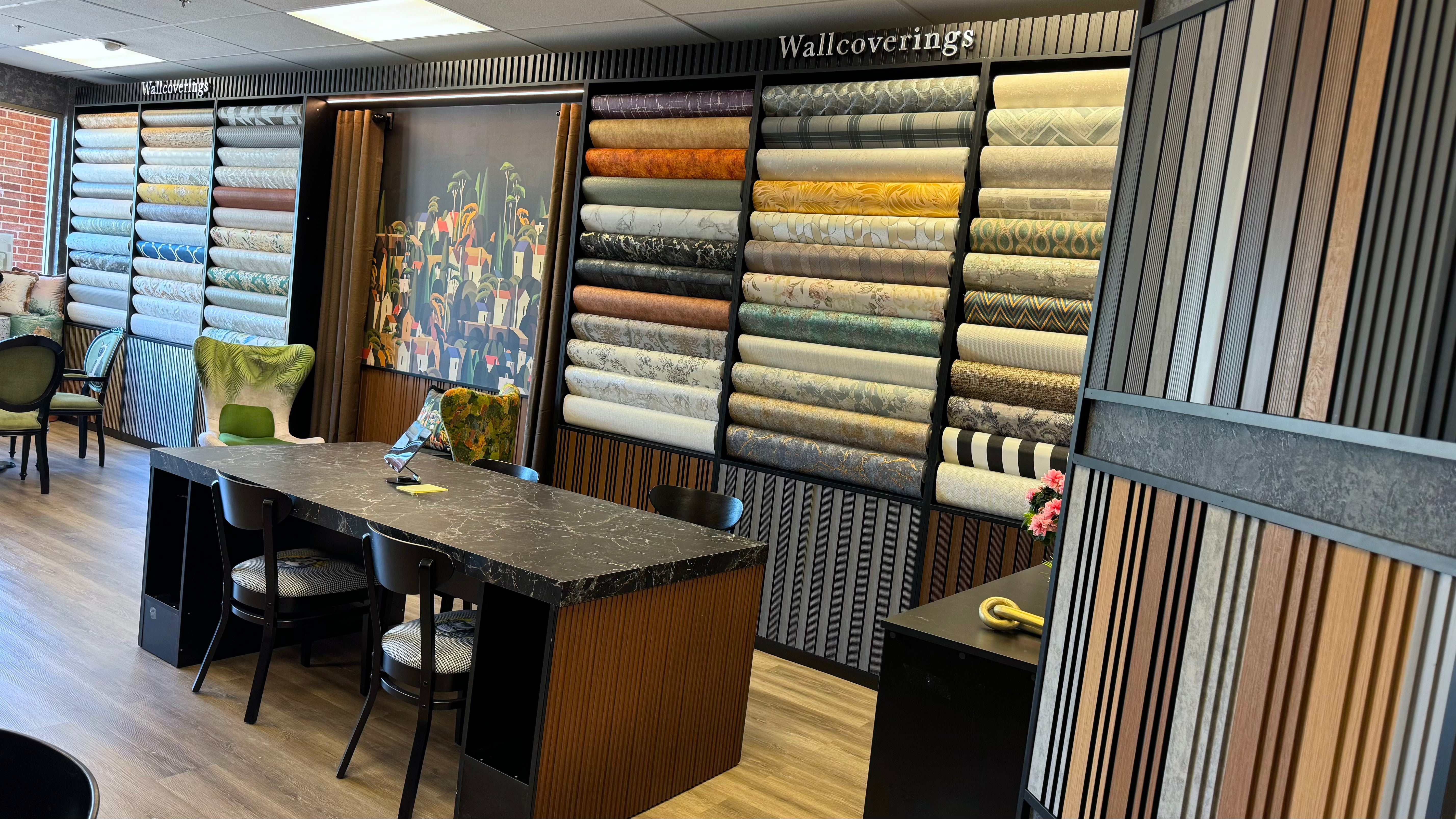

Why Do Some Wallpaper Patterns Feel Calm While Others Feel Visually Restless?
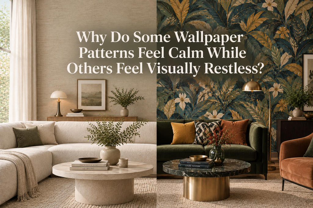
Why does one wallpaper pattern make a room feel immediately composed, while another seems to keep the eye constantly moving?
The answer is rarely as simple as color.
Two wallpapers can share the same palette, material, and general style yet create completely different experiences. One may feel quiet, architectural, and effortless. Another may feel energetic, crowded, or visually demanding.
That difference comes from how a pattern behaves across a wall.
Pattern creates rhythm. It establishes repetition, movement, scale, contrast, and visual density. These qualities influence how quickly the eye moves through a space and how easily the surrounding architecture, furniture, and materials can coexist with the wall.
This is why choosing wallpaper should involve more than asking whether you like the design.
The more important question is:
How does the pattern behave inside the room?
Understanding that behavior makes it easier to create interiors that feel intentional rather than simply decorated.
Calm Is a Visual Condition, Not a Color Palette
When people describe an interior as calm, they often associate it with beige, white, soft gray, or other neutral colors.
But color alone does not create visual calm.
A room covered in a pale but highly complicated pattern can feel more visually active than a room featuring a deep, richly colored wallpaper with a restrained texture.
Calmness often comes from organization.
When the eye can quickly understand the relationship between the elements on a wall, the pattern becomes easier to process. Repetition feels predictable. Spacing creates breathing room. Contrast remains controlled. The design becomes part of the overall composition rather than demanding attention at every moment.
This means a sophisticated, colorful, or even dramatic wallpaper can still create a sense of visual calm.
The key is not necessarily how quiet the wallpaper looks.
It is how clearly the design is organized.
Rhythm Determines How the Eye Moves
Every repeating wallpaper pattern creates rhythm.
The eye begins to recognize recurring shapes, intervals, directions, and relationships. When that rhythm is consistent, the wall can feel stable and coherent.
This is particularly noticeable with geometric patterns.
Repeated lines, arches, grids, or structured motifs establish a visual system. Once the eye understands that system, it no longer needs to examine every individual element.
Organic patterns can achieve the same effect.
A repeating botanical motif, for example, may feel calm when its forms follow a consistent scale and spacing. The individual leaves become less important than the rhythm created by the entire wall.
Visual restlessness often appears when that rhythm becomes unpredictable.
Large variations in motif size, direction, spacing, and contrast introduce more visual events. The eye has more information to process and fewer opportunities to settle.
Pattern Scale Changes Architectural Perception
Scale is one of the most powerful tools in wallpaper design.
Small patterns can create a continuous surface quality. From a distance, individual motifs may visually merge into an overall texture.
Large-scale patterns operate differently.
They can become architectural gestures.
An oversized botanical form may frame a bed or dining table. A large geometric composition can emphasize the width of a wall. An expansive abstract pattern can create a visual focal point where the architecture itself is relatively restrained.
This does not automatically make a large pattern restless.
In fact, large patterns can sometimes feel calmer than dense small-scale designs because they contain fewer repeated visual events.
The relationship between pattern scale and room scale is what matters.
A large room with generous proportions may absorb a dramatic pattern comfortably. A compact room filled with furniture may require more consideration because there is already substantial visual information competing for attention.
Visual Density Is Often More Important Than Complexity
A wallpaper can be intricate without feeling chaotic.
The distinction lies in visual density.
Imagine two wallpapers.
The first contains detailed botanical illustrations separated by generous areas of background. The second uses simpler shapes, but those shapes are packed tightly across the entire surface.
The first may actually feel quieter because the eye has more negative space.
This is an important distinction when evaluating wallpaper.
Do not judge a pattern only by how complicated its individual elements appear. Consider the total amount of information distributed across the wall.
Ask:
-
How closely are the motifs placed?
-
How much background remains visible?
-
Do elements overlap?
-
Does the pattern have a clear rhythm?
-
Are there natural places where the eye can rest?
These questions reveal the visual character of a wallpaper much more accurately than simply describing it as "busy."
Contrast Determines How Loud a Pattern Feels
Pattern and contrast are closely connected.
A motif that closely relates to its background can create a softer, more integrated surface. A sharply contrasting motif becomes more noticeable and visually assertive.
Consider a simple geometric pattern.
In two closely related tones, it may read almost like architectural texture.
In black and white, the exact same geometry can become a strong graphic statement.
Neither approach is inherently superior.
The question is what the room needs.
A space with expressive furniture, artwork, flooring, and lighting may benefit from lower-contrast wallpaper.
A minimalist interior with simple furniture and restrained architecture may have room for stronger contrast because the walls can carry more of the visual identity.
Movement Can Become an Architectural Tool
Wallpaper can influence more than atmosphere.
It can change the way architectural proportions are perceived.
Vertical patterns encourage upward movement and can reinforce the impression of height.
Horizontal structures can emphasize width and create visual continuity across a wall.
Diagonal patterns introduce energy and directional tension.
Flowing organic patterns can guide the eye around architectural features, furniture, or focal points.
This makes wallpaper particularly interesting from an architectural perspective.
The wall is no longer simply a surface receiving decoration.
It becomes part of how the room is visually organized.
Why Organic Patterns Can Feel Either Serene or Energetic
Nature-inspired wallpaper is often described as calming, but the subject matter itself does not guarantee a peaceful result.
A restrained branch pattern with subtle tonal variation may feel quiet and contemplative.
A dramatic tropical composition with oversized leaves, multiple overlapping forms, and strong contrast can feel immersive and energetic.
Both designs reference nature.
What changes their effect is the way the pattern is constructed.
The same principle applies to florals, marbled surfaces, abstract forms, waves, clouds, and other organic references.
The subject creates an association.
The design language determines the experience.
Texture Adds Another Layer of Information
Texture can change the way a wallpaper is perceived without necessarily adding more printed imagery.
Embossed surfaces create physical variation. Light moves across raised areas, producing subtle changes in shadow and reflection.
This can give a wall depth while keeping the visual composition relatively restrained.
A textured wallpaper may therefore provide interest without requiring an elaborate pattern.
But texture can also contribute to visual intensity when combined with strong pattern, high contrast, and complex color variation.
Think of every design element as another layer.
Pattern is one layer.
Texture is another.
Color contrast is another.
When several layers become highly expressive at the same time, the wall naturally becomes more dominant.
That may be exactly what the interior needs—or it may require more restraint elsewhere.
Lighting Reveals the Pattern's Real Personality
Wallpaper should never be evaluated independently from light.
Natural daylight reveals different levels of contrast throughout the day. Directional sunlight can emphasize embossing and texture. Warm evening lighting can deepen certain colors and soften others.
A wallpaper that appears subtle in a showroom may become dramatically more expressive when illuminated from the side.
This is particularly important with textured, embossed, metallic, or dark wallpapers.
Instead of asking whether a pattern looks calm under one lighting condition, consider how it behaves across the entire day.
A well-designed interior changes.
The wallpaper should be able to change with it.
The Room Around the Wallpaper Matters
A pattern does not exist in isolation.
Its perceived intensity depends on everything surrounding it.
A detailed wallpaper can feel remarkably sophisticated when paired with simple furniture and a controlled material palette.
The same wallpaper can feel overwhelming when combined with patterned upholstery, decorative rugs, elaborate artwork, strong flooring, and numerous accessories.
This is why visual hierarchy matters.
A room needs a clear understanding of what should attract attention first, second, and third.
Wallpaper can be the primary statement.
Or it can quietly support another architectural or furniture feature.
Trying to make everything equally noticeable is usually what creates visual competition.
Calm Interiors Can Still Be Dramatic
Visual calm should not be confused with minimalism.
A dark green wallcovering with subtle embossing can feel deeply atmospheric.
A charcoal geometric pattern can create sophistication without visual noise.
A rich burgundy botanical design can feel intimate and controlled when the surrounding materials are carefully selected.
The common factor is not neutrality.
It is restraint.
A calm interior can contain strong colors and luxurious textures as long as the elements share a coherent visual language.
This is especially relevant to contemporary interiors where depth, materiality, and character are often more important than simply maintaining a neutral palette.
When Visual Restlessness Is Actually Useful
Not every room needs to feel calm.
Some spaces benefit from movement.
Entryways can use energetic patterns to create an immediate sense of identity.
Dining rooms can accommodate stronger compositions because they are naturally social and active spaces.
Creative workspaces can benefit from visual stimulation.
Powder rooms can support more experimental wallpaper because their limited scale allows the design to become an immersive experience.
In these situations, visual energy can be intentional.
The objective is not to eliminate movement.
It is to give movement a purpose.
How to Evaluate Wallpaper Before Choosing It
Before committing to a pattern, consider it from several distances.
From Close Range
Look at the individual details.
How much information does the pattern contain?
Is the texture subtle or pronounced?
Do different elements compete with each other?
From Across the Room
Step back.
Does the wallpaper become a unified surface, or do the individual motifs continue demanding attention?
This perspective often reveals much more about how the wallpaper will actually function.
From the Entrance
Look at the entire room.
Consider the wallpaper alongside furniture, flooring, windows, lighting, and architectural features.
Does it establish hierarchy or disrupt it?
Under Daylight and Artificial Light
Observe how the colors and textures change.
A pattern should be considered as part of the room's lighting environment, not as an isolated sample.
Five Questions to Ask Before Choosing a Pattern
A useful wallpaper evaluation can be reduced to five questions:
1. What is the rhythm?
Is the pattern predictable, flowing, irregular, or highly directional?
2. What is the scale?
How large are the motifs relative to the wall and the room?
3. What is the density?
How much visual information is distributed across the surface?
4. What is the contrast?
How strongly does the pattern separate from its background?
5. Where should the eye rest?
Does the composition provide enough visual breathing room?
These questions shift the decision from personal preference alone toward spatial design.
Common Reasons a Wallpapered Room Feels Too Busy
Visual restlessness often comes from several decisions working together rather than from the wallpaper itself.
Too Many Competing Patterns
Wallpaper, rugs, curtains, upholstery, and artwork can all introduce pattern.
When several patterns have equal visual strength, hierarchy becomes difficult to establish.
Ignoring Scale
A small room can become visually concentrated when multiple elements use detailed, small-scale patterns.
Matching Everything Too Precisely
Repeating the exact wallpaper colors throughout every object can make the composition feel overly coordinated.
A better approach is to create relationships rather than duplicates.
Overlooking Existing Architecture
Windows, doors, shelving, fireplaces, beams, and built-ins all divide a wall visually.
The wallpaper needs to work with these interruptions.
Treating Every Wall as a Statement
Sometimes the strongest design decision is allowing one surface to lead while other elements provide visual breathing room.
The Difference Between Visual Calm and Visual Silence
A room does not need to be silent to feel calm.
This distinction is important.
A sophisticated interior may contain texture, pattern, rich color, natural materials, and architectural detail while still feeling balanced.
Visual calm comes from hierarchy and relationships.
When the eye understands where to look and where to rest, even a highly expressive room can feel composed.
This is ultimately what separates a thoughtfully designed wallpapered interior from a collection of attractive individual elements.
Final Thoughts
Some wallpaper patterns feel calm because their rhythm is predictable, their density is controlled, their contrast is considered, and their visual movement has a clear direction.
Others feel restless because multiple layers of information compete simultaneously for attention.
Neither quality is automatically right or wrong.
The right pattern depends on the architecture, room function, lighting, furnishings, and atmosphere you want to establish.
Wallpaper is most successful when it behaves as part of the space rather than as something placed on top of it.
At Walloro, the most interesting way to think about wallpaper is not simply as pattern.
It is as visual structure.
It can establish rhythm, change perceived proportions, frame architecture, create atmosphere, and determine how the eye travels through a room.
When those decisions are intentional, even a bold pattern can feel composed—and even a simple pattern can become architecturally powerful.