



Mixing Wallpaper Patterns: A Designer's Guide to Harmony
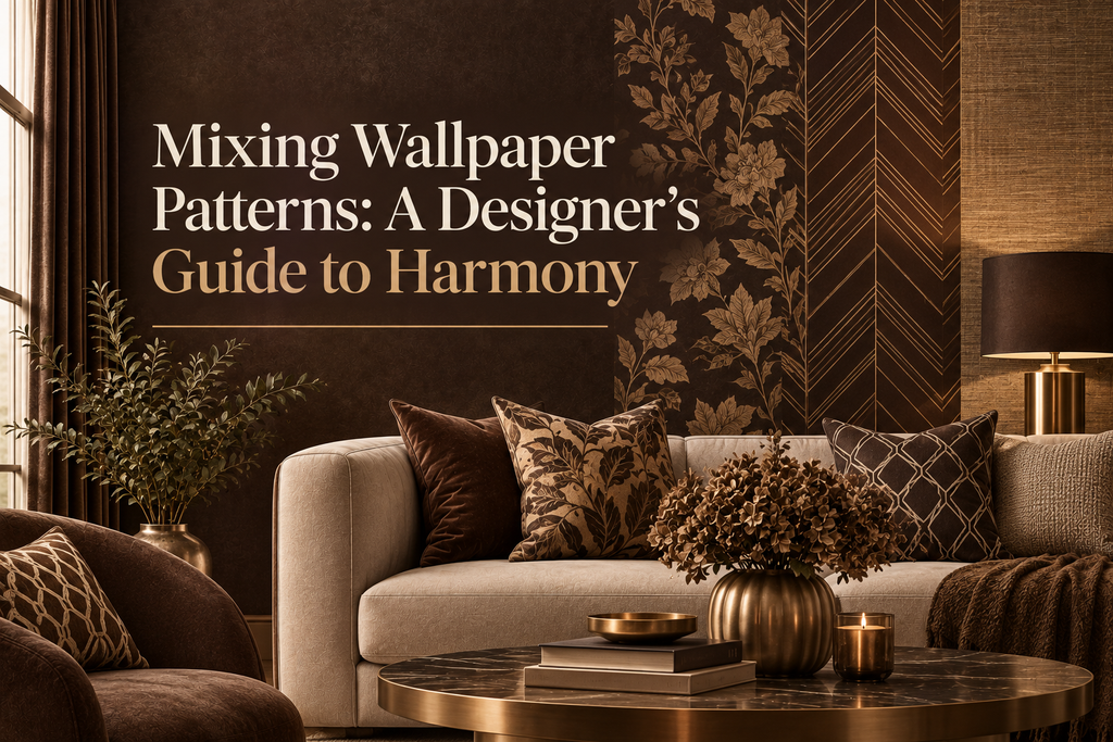
Wallpaper has the power to define a room, but using more than one pattern throughout a home requires a thoughtful approach. The goal isn't to make every wall match. It is to create a visual connection between spaces while allowing each room to have its own personality.
From subtle textures and geometric designs to botanical prints and dramatic statement patterns, multiple wallpapers can work beautifully together when they share a clear design language.
For homeowners wondering how to mix wallpaper patterns without making a home feel chaotic, the answer comes down to color, scale, texture, and balance.
Why Mix Wallpaper Patterns?
Using different wallpaper patterns can make a home feel more layered and intentional. Instead of relying on one repeated design, you can give different rooms distinct moods while maintaining an overall sense of cohesion.
Pattern mixing can also help define spaces. In an open-plan home, for example, a subtle textured wallpaper might establish the living area while a more expressive pattern visually separates the dining space.
Different patterns can also emphasize architectural features. A bold wallpaper can draw attention to an accent wall, while a quieter design can frame a hallway or transition between rooms.
The key is to make the wallpapers feel related rather than randomly selected.
Start With a Design Direction
Before choosing individual wallpapers, establish the overall feeling you want throughout the home.
Ask yourself:
-
Do you prefer contemporary or traditional interiors?
-
Should the home feel calm or energetic?
-
Are natural materials and organic forms important to the design?
-
Do you want wallpaper to be the main feature or a supporting element?
-
Which colors already dominate your furniture and flooring?
Having a design direction makes pattern selection much easier.
For example, a modern home might combine geometric wallpaper with understated textures and abstract designs. A more classic interior could pair botanical prints, elegant damasks, and refined textured wallcoverings.
The individual patterns can differ considerably while still belonging to the same visual family.
The Most Important Rule: Control the Scale
One of the easiest ways to create harmony between different wallpaper patterns is to vary their scale.
Imagine using three wallpapers:
-
One with a large-scale botanical motif
-
One with a medium geometric pattern
-
One with a small, subtle texture
Because each pattern occupies a different visual scale, they are less likely to compete with one another.
If every wallpaper has a large, dramatic motif, the result can quickly become overwhelming.
Large Patterns
Large-scale patterns work especially well when you want to create a focal point. They can make a dining room, bedroom, or powder room feel more dramatic.
Medium Patterns
Medium-scale designs are useful for adding personality without dominating the room. Geometric, abstract, and repeating patterns often work well here.
Small Patterns and Textures
Small patterns and textured wallpapers provide visual breathing room. They can connect stronger designs without introducing another competing focal point.
Think of scale as a hierarchy: one pattern leads, another supports, and the third provides balance.
Use Color as the Connecting Element
Different wallpaper patterns don't necessarily need to look alike. They simply need something that connects them.
Color is one of the most effective connections.
Suppose your home features:
-
Warm beige
-
Soft olive
-
Cream
-
Deep charcoal
One room could feature an olive botanical wallpaper, another a cream geometric pattern, and another a textured charcoal wallcovering.
The patterns are different, but the repeated colors create continuity.
This approach allows you to experiment with different designs without making the home feel disconnected.
Repeat One Color Across Multiple Rooms
You don't have to use exactly the same palette everywhere.
Instead, choose one or two colors that appear repeatedly throughout the home.
For example, a muted blue might appear in:
-
A floral wallpaper in the bedroom
-
A geometric design in the hallway
-
A textured blue-gray wallcovering in the living room
The repetition creates a subtle visual rhythm.
This is particularly effective in homes where rooms are connected by open doorways or long sightlines.
Mix Pattern Types, Not Just Patterns
Pattern mixing becomes more interesting when different types of designs are combined.
For example:
Botanical + geometric + texture
can create a balanced combination because each design contributes something different.
You might use a large botanical print as the statement design, a geometric pattern in a secondary room, and a textured wallpaper in transitional areas.
Other combinations can include:
-
Floral + stripe + texture
-
Abstract + geometric + plain texture
-
Damask + botanical + subtle pattern
-
Organic pattern + linear design + textured wallcovering
The objective isn't to find wallpapers that look almost identical. It is to create contrast within a controlled framework.
Texture Counts as a Pattern
Pattern mixing doesn't have to mean combining several printed wallpapers.
Texture itself can play an important role.
Embossed, linen-inspired, plaster-effect, metallic, and dimensional wallcoverings can act as quieter counterparts to printed patterns.
This is particularly useful if you love bold wallpaper but don't want every room to feel visually busy.
For example, a dramatic patterned wallpaper in the dining room could transition into a subtle textured wallcovering in the adjacent hallway.
The two spaces feel connected without competing for attention.
Follow the 60–30–10 Principle
A useful starting point for wallpaper coordination is the 60–30–10 approach.
Think of your overall interior as:
-
60% dominant or foundational color/design
-
30% secondary color or pattern
-
10% accent color or statement pattern
This doesn't mean you need to calculate exact percentages. It is simply a way to establish visual hierarchy.
For wallpaper, the principle might look like this:
60% — subtle textured or neutral wallcovering
30% — medium-scale patterned wallpaper
10% — dramatic statement wallpaper
This prevents every pattern from competing for the same level of attention.
Consider the Rooms You Can See From Each Other
One of the biggest mistakes when mixing wallpaper is choosing each room independently.
Instead, consider the sightlines throughout your home.
If you can see the dining room from the living room, the wallpapers should relate in some way.
They don't have to match. In fact, matching them too closely can make the design feel predictable.
Instead, look for a shared element such as:
-
A recurring color
-
Similar undertones
-
Complementary pattern scale
-
Related materials
-
A common design era
-
Similar levels of visual intensity
Rooms that are completely separated by doors provide more freedom to experiment.
Open-Plan Homes Need More Coordination
Open-plan interiors require additional attention because several spaces are visible simultaneously.
Using three completely different bold wallpapers within one open area can make the space feel fragmented.
A better strategy is to select one dominant wallpaper and use quieter designs around it.
For example:
Living area: subtle textured wallpaper
Dining area: medium-scale geometric wallpaper
Kitchen transition: understated linear texture
The designs are different, but the overall visual weight remains balanced.
Let One Room Be the Star
Not every room needs an equally dramatic wallpaper.
In fact, one of the best ways to mix patterns successfully is to give each room a different level of intensity.
You might have:
-
A sophisticated textured living room
-
A bold dining room
-
A calm bedroom
-
A playful powder room
-
A subtle hallway
This creates a rhythm as you move through the home.
The strongest pattern becomes more effective because it isn't surrounded by equally strong designs.
Match Wallpaper With Furniture
Wallpaper should work with the objects already in the room.
Before selecting a pattern, consider:
-
Sofa fabric
-
Curtains
-
Rugs
-
Wood tones
-
Upholstery
-
Lighting
-
Artwork
-
Metal finishes
If the furniture already has a strong pattern, a quieter wallpaper may provide better balance.
If the furniture is mostly solid and understated, wallpaper can take a more prominent role.
This relationship between wallcovering and furniture is often more important than whether two wallpapers technically "match."
Don't Forget Undertones
Two wallpapers can appear similar in a store but look completely different once installed.
Warm beige, cool beige, gray-beige, and cream can have very different undertones.
The same applies to:
-
Whites
-
Greens
-
Blues
-
Grays
-
Browns
When combining wallpapers, compare samples under the lighting conditions of your home.
Natural daylight, warm bulbs, and cool LED lighting can significantly change how colors appear.
Use Transitional Spaces Strategically
Hallways, staircases, entryways, and connecting spaces are excellent places to introduce quieter wallpaper.
These areas can act as visual transitions between more expressive rooms.
For example, a home might move from:
Bold botanical → textured neutral → geometric → soft organic pattern
rather than jumping directly from one dramatic pattern to another.
This creates a sense of movement while maintaining harmony.
How Many Wallpaper Patterns Are Too Many?
There is no universal maximum.
A smaller home might feel beautifully balanced with two or three coordinated wallpaper designs. A larger home with clearly separated rooms can accommodate considerably more.
The important factor isn't the number of patterns. It is how much visual competition they create.
Five subtle, coordinated wallcoverings may feel calmer than three extremely bold patterns.
Before adding another pattern, ask:
Does this wallpaper contribute something new, or is it competing with an existing focal point?
If it contributes nothing new, a texture or quieter design may be the better choice.
Common Wallpaper Mixing Mistakes
Choosing Every Pattern Separately
Selecting wallpapers based only on whether you like each one individually can create a disconnected home.
Always consider how each design interacts with the others.
Using Too Many Bold Patterns
A home needs visual breathing room. If every room contains a dramatic statement wallpaper, none of the patterns feels particularly special.
Ignoring Scale
Patterns with identical visual scale can compete intensely.
Varying scale usually creates a more sophisticated result.
Forgetting Texture
Printed patterns aren't the only way to add visual interest. Texture can provide balance and depth without introducing another strong motif.
Matching Too Literally
Wallpaper doesn't have to match perfectly.
In many sophisticated interiors, coordination is more effective than matching.
A Simple Formula for Mixing Wallpaper
If you're unsure where to begin, try this three-step approach:
1. Choose Your Foundation
Start with a neutral or subtly textured wallpaper that can work across transitional areas.
2. Add a Supporting Pattern
Introduce a medium-scale pattern that shares at least one color or visual characteristic with the foundation.
3. Choose One Statement Design
Finally, select a stronger wallpaper for the room where you want the most visual impact.
This creates a clear hierarchy without making the home feel overly coordinated.
Create Contrast With Confidence
Good interior design isn't necessarily about avoiding contrast.
A sophisticated home can combine:
-
Smooth and textured surfaces
-
Organic and geometric forms
-
Light and dark colors
-
Large and small patterns
-
Traditional and contemporary influences
The secret is to control the relationship between those contrasts.
Wallpaper gives you an opportunity to create that balance across an entire home, not just on a single wall.
Why Walloro Makes Pattern Mixing Easier
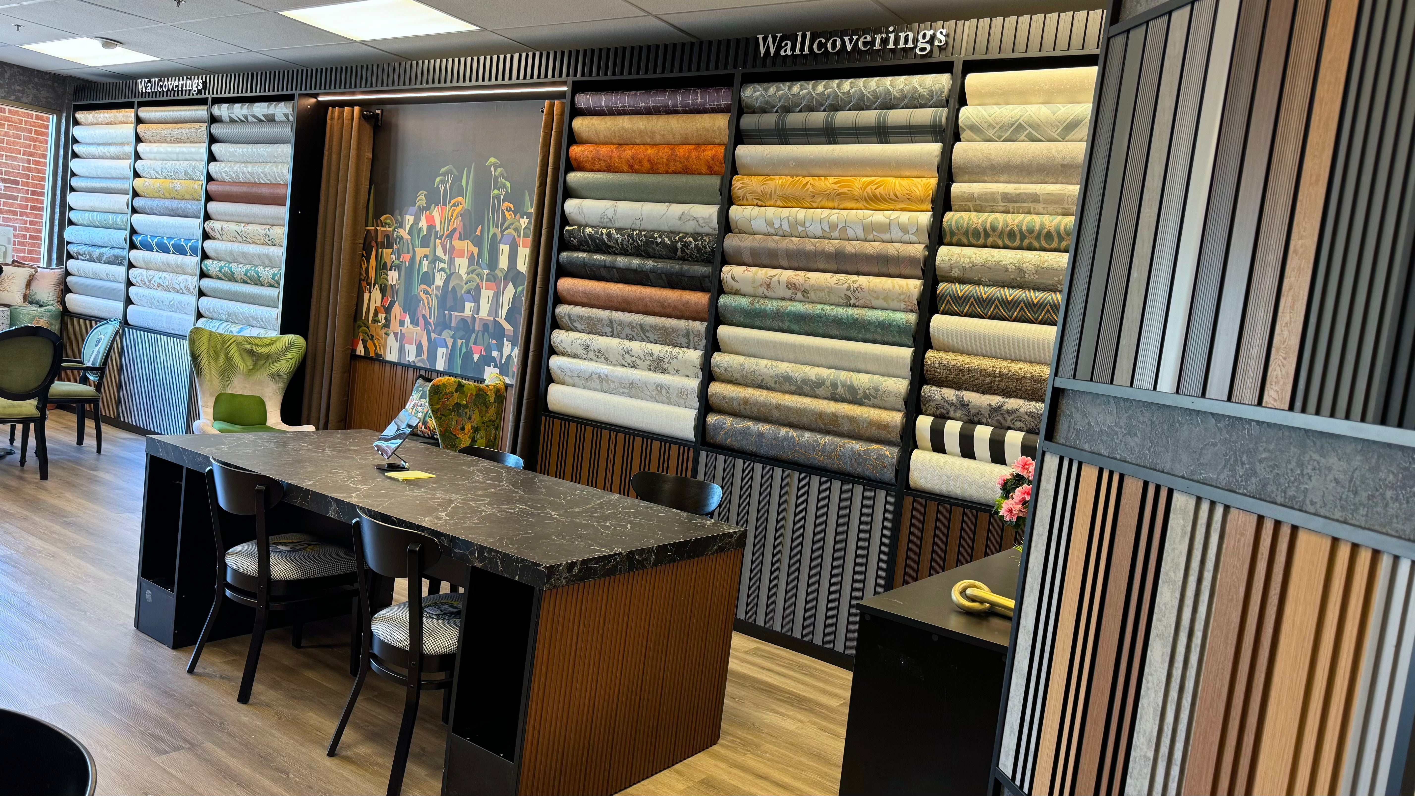
For homeowners exploring multiple wallpaper styles, the advantage of a thoughtfully developed wallcovering collection is that different designs can be considered as part of a broader design vocabulary.
Walloro approaches wallpaper with an emphasis on sophisticated patterns, textures, and versatile designs that can work across different interior styles. This makes it easier to create rooms that feel individual while still belonging to the same home.
Rather than asking whether every wallpaper matches, think about whether the collection of patterns tells a consistent design story.
Frequently Asked Questions
Can I use different wallpaper patterns in every room?
Yes. Different patterns can work beautifully throughout a home, especially when they share colors, textures, scale relationships, or a common design direction.
Should wallpaper patterns match from room to room?
Not necessarily. Coordinating patterns is usually more interesting than matching them exactly.
How many bold wallpaper patterns should I use?
There is no fixed number, but limiting the strongest patterns to selected rooms helps maintain visual hierarchy.
Can floral and geometric wallpaper work together?
Absolutely. Floral and geometric designs can create a strong contrast when they share complementary colors and have different scales.
Should hallways have the same wallpaper as the rooms?
They don't have to. A hallway can use a quieter transitional wallpaper that connects the designs used in adjacent rooms.
Does textured wallpaper work with patterned wallpaper?
Yes. Textured wallcoverings are particularly useful for creating visual breathing room between stronger patterns.
Final Thoughts
Mixing wallpaper patterns is less about following strict rules and more about understanding balance, rhythm, and visual hierarchy.
Start with a clear color story. Vary pattern scale. Combine different design types. Use texture to create breathing room, and always consider how rooms relate to one another.
Most importantly, don't be afraid of contrast.
When carefully coordinated, different wallpaper patterns can make a home feel more layered, expressive, and thoughtfully designed. The goal isn't for every room to look the same. The goal is for every room to feel like part of the same story.